This guide will explain how to customize and use the new Maps and Utility Bar user interface (UI) elements released in SWTOR 7.2, including how to set things to be almost exactly as they were before!
This guide is constructed in a way that can be helpful to both experienced and returning veterans as well as new players!
Universally Adjustable Settings in Interface Editor
Each element in the Interface Editor will have specific settings unique to that UI element. I’ll be going through all of the specific options for all elements affected by the 7.2 changes but first, I want to go over the 3 settings that are available on all elements that you can adjust individually. Defaults are listed in parentheses in case you accidentally change one and want to change it back.
Scale:
A slider that changes the size of the whole UI element, so that it takes up more or less of your screen. (Default is 1x)
Alpha:
A slider that adjusts the transparency of the whole UI element. Values lower than 100% make it more see-through. (Default is 100%)
Enabled:
A checkbox that disables the UI element completely. This is useful if you don’t want something like a minimap at all. (Default is Enabled/Checked)
Major UI Changes in SWTOR 7.2
This section will show and explain what are the most significant changes to the Map and Minimap in SWTOR Update 7.2, compared to what it was like before.
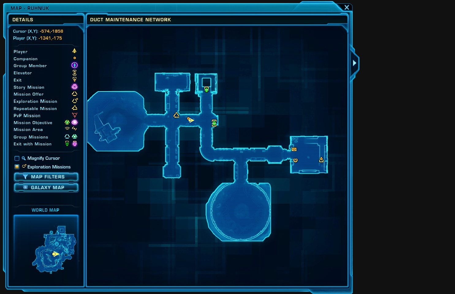
Added a Larger, Resizable Map Overlay
The biggest new UI feature is a heavily configurable map overlay. It’s what happened when the minimap and world map window had a baby.
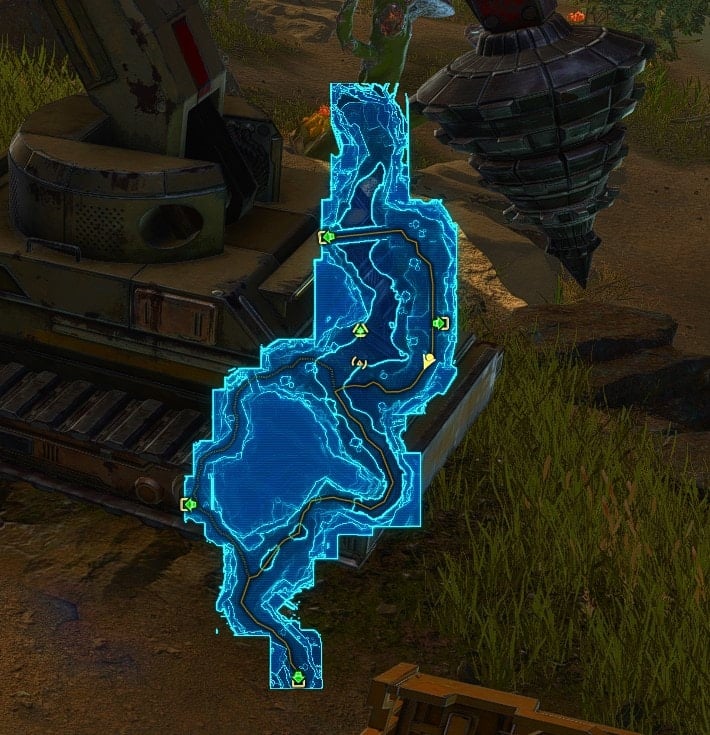
You get a bigger representation of the map that can be similar to what you get when you move around with the world map window open and it goes transparent, but without all the other interface stuff you don’t care about.
It can also be smaller than the world map window, so you can have it be just big enough to suit your needs. There are a ton of settings:
Map Internal Zoom:
A slider that changes the maximum size of the map independently from the size of the window in the interface editor. Increasing the size above 1 will enable you to zoom in without resizing the overall element, but maps can “clip” out of the rectangle size of the element. I don’t recommend changing this setting. (Default is 1x)
Icon Scale:
A slider that adjusts the size of icons on the map overlay, like mission objectives and the location of your toon. (Default 1.25x)
Label Scale:
Changes the scale of labels.
Icon Alpha:
A slider that adjusts the transparency of the icons specifically. (Default is 100%)
Map Alpha:
A slider that adjusts the transparency of the map itself, not the icons. (Default is 100%)
Map Contrast:
A slider that adjusts how different the lighter and darker areas of the map look. It’s difficult to explain briefly, play around with the slider to see what it’s doing. (Default is 70%)
Map Type:
A dropdown that allows you to define the behavior of the map relative to your toon’s position.
- Fixed: The map does not move as your toon traverses the world, so your toon moves around the whole element. (Default Option)
- Scroll: The map moves around as your toon’s position remains in the center of the element.
- Rotation: The map rotates and scrolls as your toon’s position remains in the center of the element and the direction your toon is facing defines the Northern direction.
Mouse Passthrough:
A checkbox that allows you to click things behind the map overlay when enabled. Otherwise, the map overlay will block you from interacting with anything beneath it. (Default is Enabled)
Change to Local Map When Available:
A checkbox that makes it so the map on the overlay does not change automatically upon entering an area with a different map, allowing an overlay of a map for a location that you are not currently in. (Default is Enabled)
Ping Character When in Motion:
A checkbox that makes it so your character emits radar pulses on the map while moving, making your position easier to track at a glance. (Default is Disabled)
Alternative Minimap
The minimap now has two variants, a new Minimal version that’s just a floating circle along with the existing Maximal version that has all the buttons and indicators you’re used to.
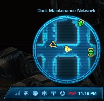
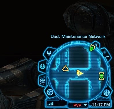
Beneath the Minimal version is one of the two customizable utility bars. Pictured above is Utility Bar 2, which can house all of the buttons and indicators that surround the Maximal map version.
All the buttons and indicators can be placed in any order you like and you can completely omit any you don’t use. For example, I don’t use the Zoom or Modify Filters buttons on the minimap, so I turned those off.
More on Utility Bars
Utility bars are customizable new-ish interface elements for previously existing buttons in the UI. Basically, BioWare has taken all of the buttons and indicators that used to surround the minimap, like Group Finder, Time, Map Filters, etc., and put them into a new element they call a Utility Bar.
The utility bar is more reminiscent of other existing elements like the menu bar, but you can customize which buttons and indicators are available as well as the order they appear in. BioWare also took this opportunity to turn the social bar (that includes the welcome window dropdown thing) into a utility bar using the same system, so you actually have 2 utility bars.
The orientation of the bar is governed by which quadrant of the screen it’s in such that the angled side is always slanted towards the center of the game window and closest top or bottom edge.
Both bars can be moved and configured using the Interface Editor where you can pick what to put in each slot through a bunch of dropdowns. Only Utility Bar 1 gives you access to everything; Utility Bar 2 is limited to the buttons and indicators that surround the Maximal Minimap.
Utility Bar 1 has up to 18 slots while Utility Bar 2 only has 11. You can put all of these buttons on Utility Bar 1 if you want.
The buttons and indicators load from left to right starting with Slot 1 without any spacing, so if you want a space, you have to slot in Spacer or Divider.
Spacer is just an empty slot while Divider uses a little dividing vertical line instead of an icon. There are no other settings for the utility bar.
Signal is available to both bars and tells you the quality of your connection and latency.
Design Tweaks to World Map Window in Update 7.2
The World Map window has been tweaked, though the changes aren’t nearly as significant as those to other windows like the Character Sheet back with the launch 7.0.
The information has mostly just been condensed so it’s more compact with the mission tracker now being a collapsible tab.
Here is the old map, from before 7.2:
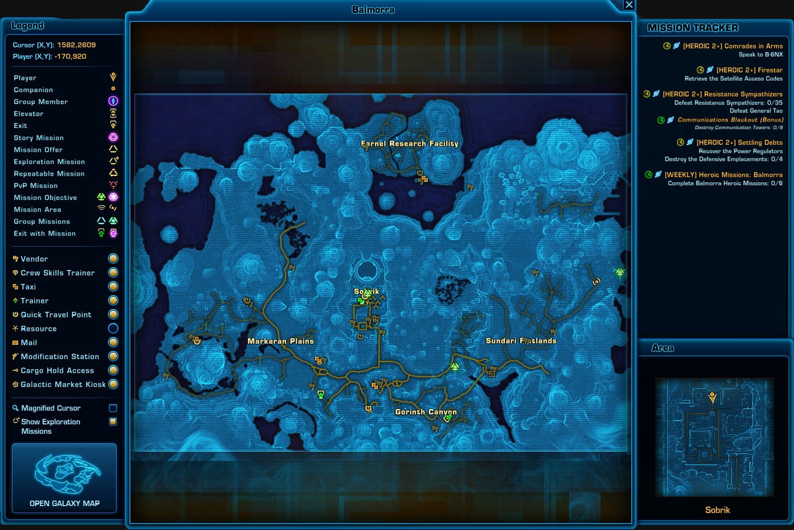
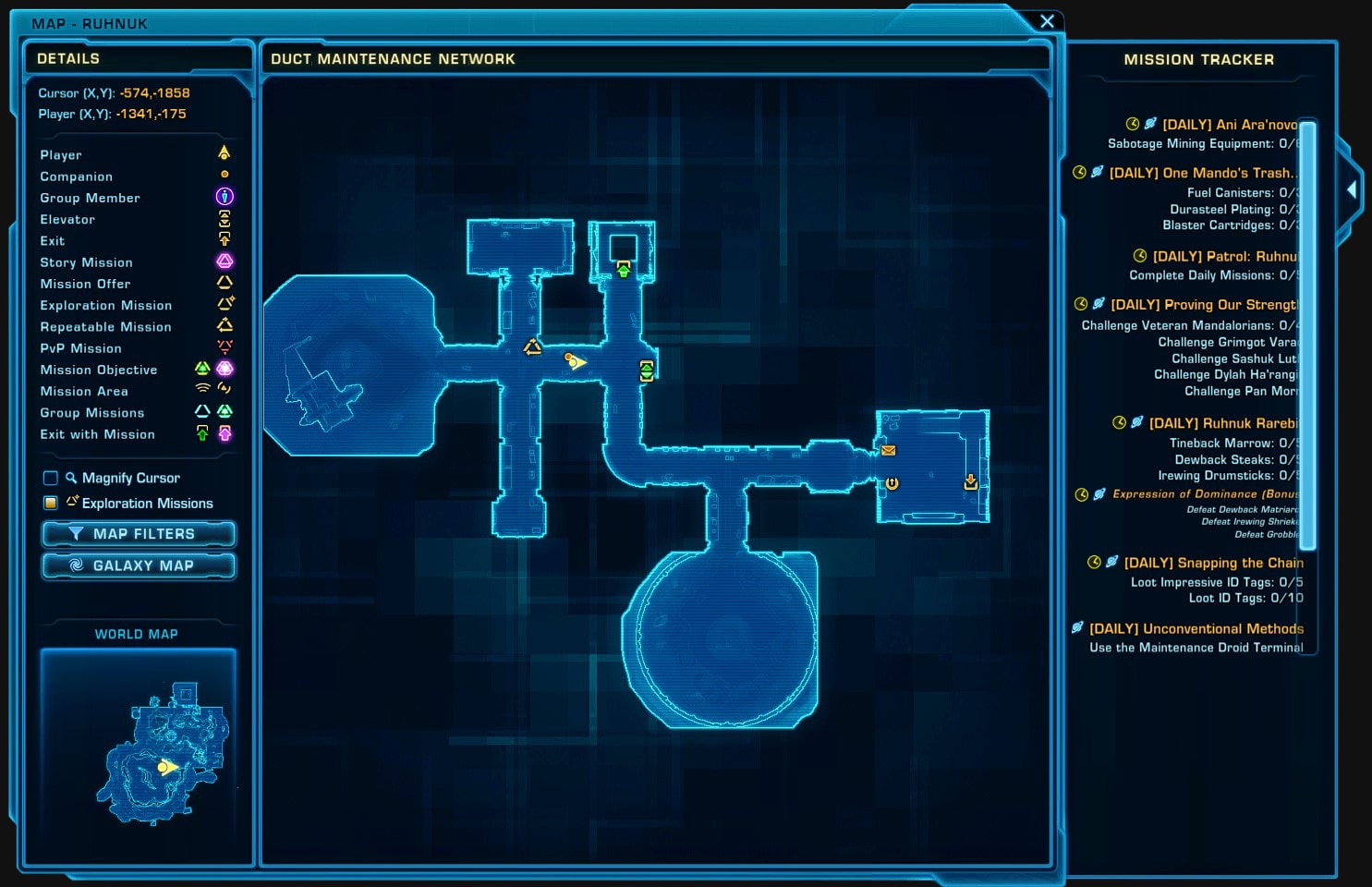
And here are two examples of the new map, after 7.2 with and without the side panel:
Unlike with the minimap, it does not appear that this old style for the World Map window will continue to be available.
Option to Mouse-Over Ability Tooltips
BioWare has given us an additional way to display the large tooltip where it always displays on mouse-over, including for targeting and ability tooltips, instead of just for items as it does now.
It’s certainly a nice feature on paper, but it’s pretty distracting to have these big, dark boxes of text pop up all over the screen in the middle of combat. I think that might be why BioWare never added it before.
In any case, you can enable it by locating the Large Tooltip element (it’s probably anchored to the minimap) and setting Tooltip Anchor as Anchor to Mouse Pointer.
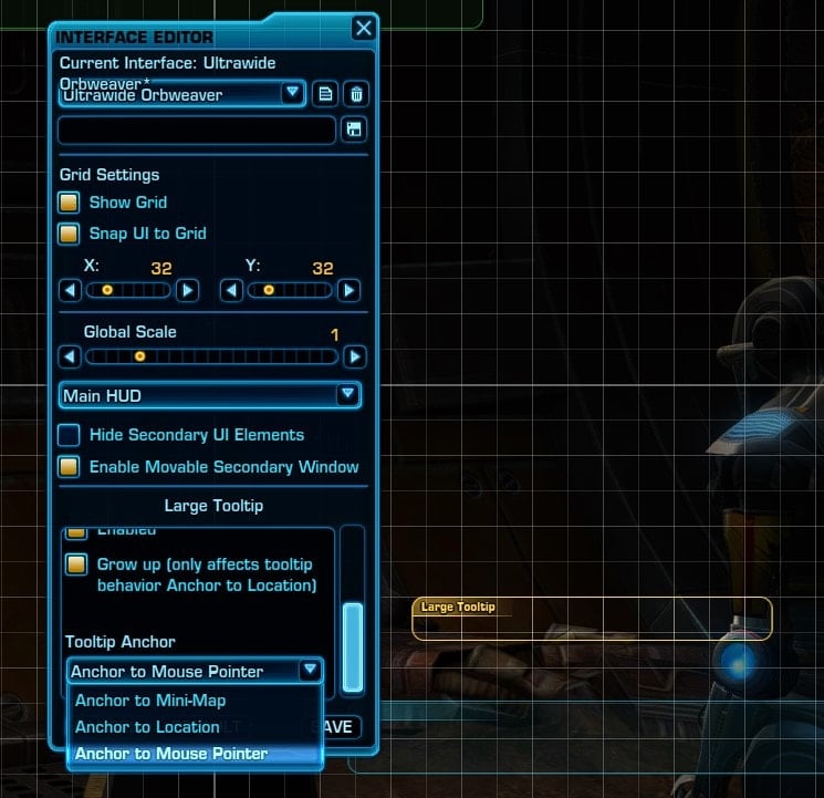
If you do plan to Anchor to the Mouse Pointer, I highly recommend playing around with the Alpha slider to adjust the (Opacity/Transparency) and hope that BioWare offers a better solution in the future.
How to get the old Mini Map and UI from before 7.2
Some of you probably don’t want to go through the hassle of relearning everything when the old way worked just fine for you. I have good news, BioWare seems to have learned from player reactions to previous UI overhauls in 7.0 by enabling you to keep things almost exactly as they were before 7.2.
This section of the guide will focus entirely on how to set things back to the way they were, though I recommend still taking a look at the customization options
I apologize if it sounds like I am being condescending, it is not my intention. I understand that a more significant chunk of people who want to go back to the old way aren’t as tech-savvy. I just don’t want to leave those people behind by omitting steps that may seem obvious to someone else reading.
While I respect wanting to keep things as they are, I do want to point out that BioWare has genuinely expanded functionality and encourage you to at least check out the options for the larger map overlay and mouse-over tooltips because they’re quite nice.
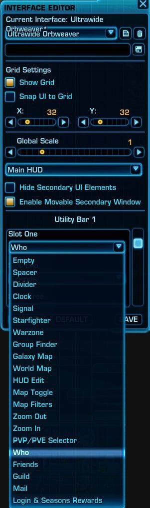
Utility Bar 1
The first utility bar can be found in the top left corner of the screen. There are 18 slots in total that you can customize with a specific button or indicator.
Utility Bar 1 gives you access to all of the buttons and indicators from both bars, but Utility Bar 2 only gives you access to buttons and indicators that surround the old minimap style.
Here is what you should set each of the slots to so that they match the order that they existed previously:
Slot 1: Who
Slot 2: Friends
Slot 3: Guild
Slot 4: Mail
Slot 5: Login & Season Rewards
Slot 6: Divider
Slot 7: Spacer
Slots 8-18: Empty
Slots 6 and 7 are optional and just make it look a little nicer by adding a bit of space and symmetry so that the Welcome Window isn’t wider than the Utility Bar. Divider makes that little line while Spacer is just empty space. The Open Welcome Window button is now the leftmost button and is an exclamation point with a circle around it instead of a dropdown arrow.
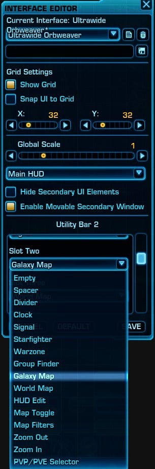
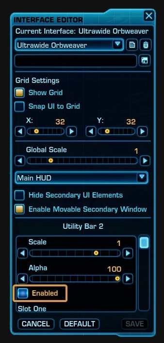
Utility Bar 2
We can disable Utility Bar 2 because all of the buttons and indicators will still surround the minimap. In order to do this, uncheck Enabled, which will disable it, turning the associated element red.
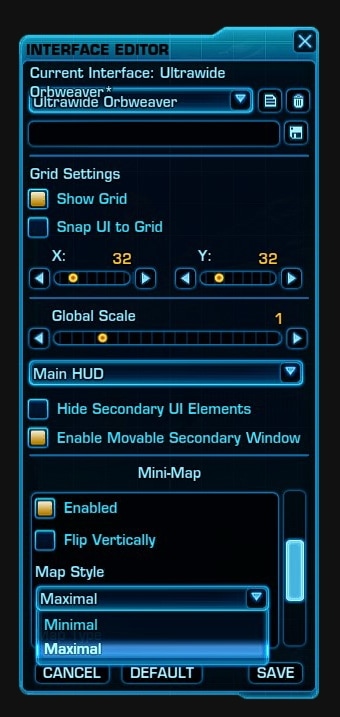
Minimap
The big setting to change is the dropdown that is called Map Style. Set Map Style to Maximal so the game will let you use the pre-7.0 style with all the buttons around it.
You may want to consider adjusting the other specific settings which do the following:
Flip Vertically:
A checkbox that makes it go upside down in case you wanted it to be stuck to the top half of your screen instead. (Default is Disabled/Unchecked)
Map Style:
A dropdown that controls whether you have all the buttons and indicators surrounding the map or just a floating circle. Maximal is the old style with buttons and indicators. Minimal is just a floating circle of the map with buttons and indicators removed. (Default is now Minimal)
Map Type:
A dropdown that controls cardinality. The Rotation setting makes it so your character’s forward-facing direction is North and the map rotates to accommodate that. The Scroll option makes it so your character rotates and the map has a constant North, South, East, and West that scrolls to accommodate that. (Default is Scroll)
Icon Scale:
A slider that exclusively adjusts the size of little icons you can filter out, like your character’s location, gathering nodes, mailboxes, vendors, etc., without altering the size of the map, buttons, or indicators. (Default is 1x)
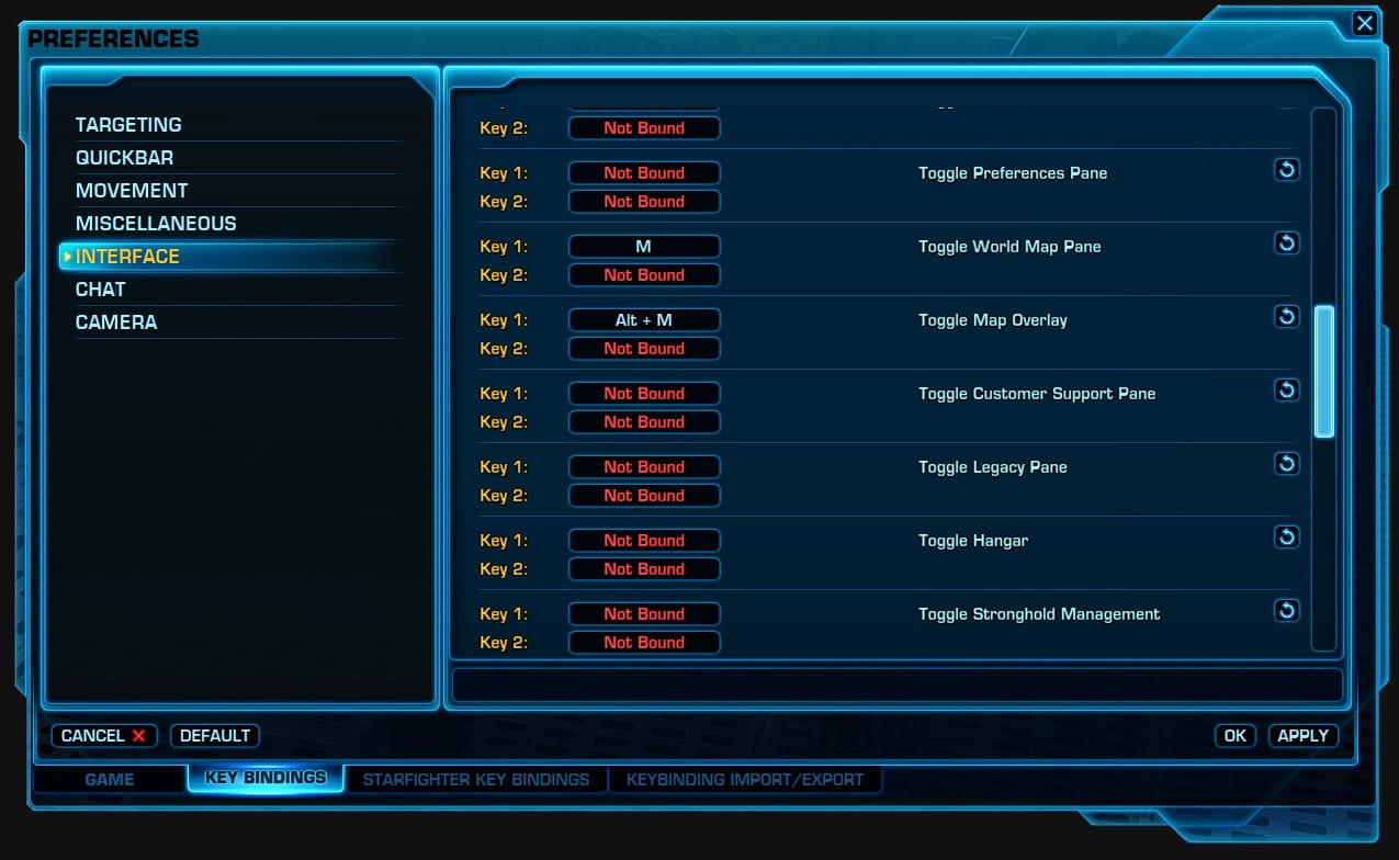
Adjusting Key Bindings
BioWare has set the default keybindings such that Alt + M toggles the Map Overlay while M toggles the World Map Pane. You can change it back by going to Preferences -> Key Bindings tab -> Interface and binding these options to something else.
Unless you regularly use some feature that’s only found on the full world map, I highly recommend using the map overlay instead and just adjusting the positioning, size, and alpha (opacity) to your liking since it can be far less obtrusive while still giving you the information you need.
Considerations and Recommendations
I do use an ultrawide monitor, so I’m not sure how well this will work for those of you using 16:9, but I almost exclusively use the new World Map Overlay + Utility Bar in lieu of a minimap.
The only limitation I’ve found with this approach is that enemy positions are unfortunately never shown on the overlay, only the minimap, so I do need to toggle to the minimap when I need to see an enemy’s location. The most notable instance is when Corruptor Zero jumps up for his massive laser attack.
This is an example of what the bottom right corner of my screen looked like on the PTS:
Of course, this isn’t the only way to use the World Map Overlay. You might want to take advantage of the dedicated ![]() Map Toggle button to swap between the minimap and overlay as a better replacement for the big World Map window you probably use currently.
Map Toggle button to swap between the minimap and overlay as a better replacement for the big World Map window you probably use currently.
I imagine that a lot of you probably haven’t taken a good look at the Interface Editor in a long time either. Since you’re going to be acclimating to a new appearance anyway, this is a good opportunity to make adjustments to other UI elements as well.